
Quarantine Art - DIY Colour Wheel!
So the whole world is suddenly thrown into social isolation or quarantine. Watching the news around the world and worrying about friends and family has left me emotionally and mentally dysfunctional. As of today, April 1st, I’ve already lost a friend and colleague to the virus and heard of many others in the hospital being treated for it. It’s easy to say that everything will be okay, but it’s hard to believe it. I am incredibly lucky to still have enough illustration projects to financially support me, and I am holding onto that gratitude dearly.
In a time like this, with many people at home, it’s an opportunity to put your art supplies to use. Many of you out there have random art supplies in boxes or sheds that never get touched. I have tons in my home studio, but many things such as my acrylic paints and coloured pencils are quarantined at the Nolan Gallery where I usually teach.
SO… I bring you these ideas to try — not for the sake of perfection or of becoming an artistic master. I bring them to you so you can find small pockets of joy and mindfulness in your quarantined days.
Here is a pile of the paints I currently have at home.
Why do we bother with colour wheels?
The colour wheel is a great way to introduce yourself to the magic of colour mixing. It also shows us the relationships between colours. For this one I have included shades, tones and tints as well to get the fuller scope of this relationship. With certain approaches to painting, you can also use it to create colour schemes for your future paintings. You could take it a step further and add tertiary colour segments.
When you use less tubes of paint and mix more, you not only save money, but you also have more unified colour. This is another reason why making your own colour wheel from primaries is a great idea. When you discover that you can make at least 24 distinctively different looks from just 3-4 tubes of paint, you will see the world with new eyes!
For this exercise you will need some primary colour paints! Red, yellow, blue and white (more on the specifics in a minute). I am using gouache for this because my acrylics are quarantined away. If you would like to follow along with acrylics, it is basically the same theory. Watercolour will be slightly different because you don’t use white- instead you use WATER.
You will also need a few other things - paper, pencil, a brush, water and paper towel/rags to wipe off excess water. I also like to have scrap paper nearby to test colour on before I make a mark on the final paper. I have included a plate to trace a circle onto the paper. Feel free to freehand yours!
The most important part of this is the colour. Because I found these random gouache paints at home, I wasn’t sure which ones were appropriate to make this colour wheel. You see, not all yellows, blues and reds are the same. I eyeballed my choices from the look of the tubes first, and then tested a few of them out.
The yellow I chose was a bright and light yellow. I eliminated the other one because it already had white mixed in to soften it. Not ideal…
Reds can be biased towards orange or purple. The red I chose was deep and a bit more purple in its bias. You’ll see why this matters later when you try to mix purple.
Blues can be biased towards green or purple and I chose the more purple one again. Ultramarine is always a safe bet.
I am happy to chat with anyone more about this, but don’t let it discourage you from getting started with whatever you have.
Once you’ve chosen your colours, it’s time to setup the layout. Don’t torture yourself over this part, the point is to mix colours, not have perfect pie pieces.
After you trace your circle onto the paper from a plate or freehand, draw a line to split it in half.
From there, find the middle and mark it with a dot. You will then connect that center dot to the outside of the circle at 2 points to create 3 even-ish sections on one side. Repeat on the other side until you have 6 pie pieces. If you want to make them exact, knock yourself out!
Then we are splitting up each pie piece to have small sections at the edge. We want 3 small sections. You can do these one pie piece at a time, or all at once. Whatever makes you happy! Haha


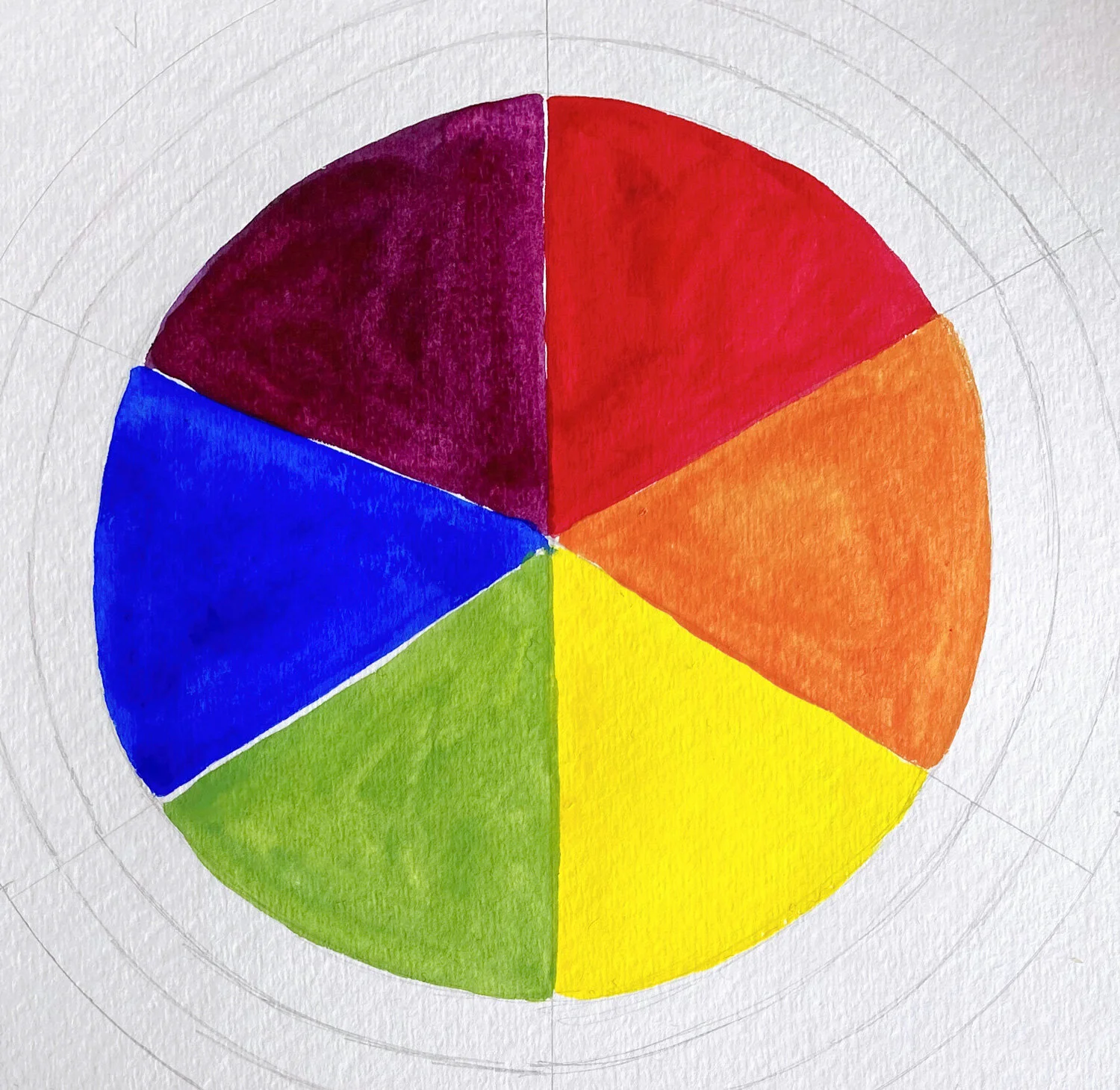
From there, label the pie pieces in this exact order (doesn’t matter which spot you start in): Red, Orange, Yellow, Green, Blue, Violet. Use initials if you like. You want to end up with something closely resembling this:

Yay! Ready to go!
The first step is to paint directly from those tubes of red, yellow and blue paints into your inner circle layer as you labeled before. Don’t mix them with anything else, but you can water them down slightly to make it glide on the paper easier. Just don’t add so much water that it becomes transparent.

Then we start mixing! Using the same red and yellow, you are going to create an orange mixture. It’s not necessarily a 50/50 split, so gradually add small bits of red to some yellow until it’s not too red orange and not too yellow orange, but looks just right to you.
Then do the same mixing your yellow and blue to make a just in between green.
To make a violet, you’ll mix some of your red and blue. This one can be tricky depending on what red paint you found at home. If the only result you get is looking brown, it’s probably because your red is too orange. That’s okay, don’t torture yourself over it, haha!
Now you have a basic colour wheel, but we aren’t just basic people are we…
We are going to add more! Next is your SHADE layer. All colours have shadows in the absence of light. The next step is an extra challenge to your colour mixing if you don’t have burnt umber or black (yuck, don’t use black unless you have to)
What you’ll need to do is make BROWN. If you have burnt umber, feel free to use it. If you have never made brown, what are you waiting for?!
To make a neutral brown, you will need to mix some of your red, yellow AND blue together. This might take a bit of back and forth, but since you have the basic colour wheel already done, it can guide you!
For example if your brown is looking too purple, look at where purple sits on the colour wheel and put more of the OPPOSITE colour in (yellow). This will neutralise it.
Feel free to do this on another palette and spread out a bit.

If it’s too red, add a tiny touch of green.
You are going to use that brown colour (or burnt umber) to create a shade colour for each pie piece. Mix a tiny bit in at a time until it feels right to you. There is no such thing as going too dark, you’re doing this for fun, remember?

Voila! Shade
After that’s done, it’s a good time to refresh your water if you haven’t already. Using dirty water will potentially influence the colours you put on paper.
The next step is to create beautiful neutralised versions for each colour! I call these the tones.
To do this you want to add a bit of your brown AND white to each original colour.

We need toned down versions for most colours, otherwise our paintings would be too chaotic to look at! It’s also a good trick to create depth in paintings.
They should look like muted versions of your shadow. If you still have your shade mixed, you can try just mixing white to those. Or start each from scratch to really control the colour.

BAM! We have tones.
Definitely rinse your brushes off again, because our last layer needs to be bright and crispy! We don’t want any brown to tone it down.
It’s time for TINTS a.k.a. your light pastel pretty layer.
To do this, mix white with each of your original colours. My advice is to always add the colour gradually to a little bit of white instead of adding white to your dark colour. This just preserves the amount of white paint you will need to use. You just do you though!

Pastel pinks and blues, yes please.
And there you have it! Your very own colour wheel to use based on your own paints.

If you are obsessed with charting and have multiple types of paints, I would suggest making one for them all! ie: Watercolour wheel, acrylic wheel, gouache etc. Try ones with different versions of your primaries, but be sure to label which ones you used on each wheel so you know how you got that colour in the future!
You will be a colour mixing genius in no time!
Let me know which other art projects/exercises you’d like to try. Be sure to share your colour wheel and tag me on insta @bermudezbahama !