A Guide For Buying Paints - Watercolour Edition

I’ve been teaching drawing and painting for a DECADE now. I hardly feel old enough to say that, but it’s true. And most of the two decades before that was spent drawing and painting as well. I’ve always loved this, it’s no secret.


Watercolours weren’t always a top choice for me. They are spontaneous, challenging to control and not as forgiving. When I started out as an illustrator I was convinced that I needed the opposite of all of those things. I wanted realistic details and control!
Something that changed my perspective on watercolour was a technique I learned during an MFA class at the Fashion Institute of Technology. Sergio Ruzzier was our guest demonstrator, and he showed us how he tints his paper yellow first. Because watercolour is a transparent medium, the yellow acts as a tint for all of the colours that are layered on top. It’s basically a warm filter that unites all of the future colour layers together. This blew my mind, and I have painted in watercolour so much since then — always with soft yellow first.
The soft yellow becomes the white of the paper. In watercolour you can always go darker, but never lighter.

Something that also makes a huge difference is the quality of watercolour paints. I’ve tried them ALL. Paints are made up of pigment and binder. For watercolour paints, the binder is gum arabica. This can be diluted with water for various results. Different companies/manufacturers also add other elements that may help the flow of the paint.
If you want your paintings to last, they need to have lightfast pigments. This means that as it is exposed to light or humidity, it will not fade or change colours. Do you remember how your classroom grade paints faded into nothingness? They are not for use beyond there. They are mixed with fillers and extenders so you actually need to use more of them to get a decent result. And no classroom paint layers will ever add up to the vivid colour you may need. If you want your painting to last more than a decade, it will need to have permanent lightfast pigments. Each paint tube should have a lightfast rating on it — excellent, very good etc.
Some of my students are like “but I’m just starting out” and they feel as though they somehow aren’t good enough to buy “real paints.” I encourage anyone who really wants to dive into what watercolour has to offer to upgrade to literally anything above classroom quality. This way you can really see what vivid pigments can do on the page. It is magic!


Colour charting your own paints is something I highly recommend.
Infinite Colour Choices?!
The thing is, you don’t need a set with a million colours. With proper colour theory and colour mixing exercises, you can mix most colours from the following type of list. However, I would add that you do need more tubes/colours if you are using watercolour instead of acrylic. This is because the more you mix watercolours together, the faster they dull. If you want the most vivid colour imaginable, it will need to come from less mixing. If you love more muted and natural colours, go right ahead with fewer options to mix with.
A Cool Red
A Warm Red
A Cool Blue
A Warm Blue
A Cool Yellow
A Warm Yellow
Pthalo Green
Umber or Sepia
Paynes Grey or something like it.
Most sets have options with those as the minimum starting point. Each brand might have its own option, and artists have their personal preferences as well. You don’t need black because you can make a very dark colour imitating black that has more life in it. Shading your colours with sepia or paynes grey can be a nice alternative to black anyway. You can make beautiful oranges and purples from those mixtures, but if you use tons of purple and hot pink in your paintings I would suggest adding it to your palette separately.
Something to be aware of is the transparency of your watercolour paints. Many tubes/pans will have a little circle on the back to indicate whether the colour is transparent or not. This is only important for your layering as you will need to put down your least transparent colours first. This will make more sense when you’re actually painting.
Lastly, the staining of each paint colour differs. This doesn’t necessarily mean the quality is better or worse, it just means you won’t be able to “lift” out certain colours because they stain the paper permanently. You’ll get to know this with your own set. It doesn’t mean you’re doing it wrong.

A classic painting exercise that I highly recommend for any medium.
Some of my favourites, which I will link to below.
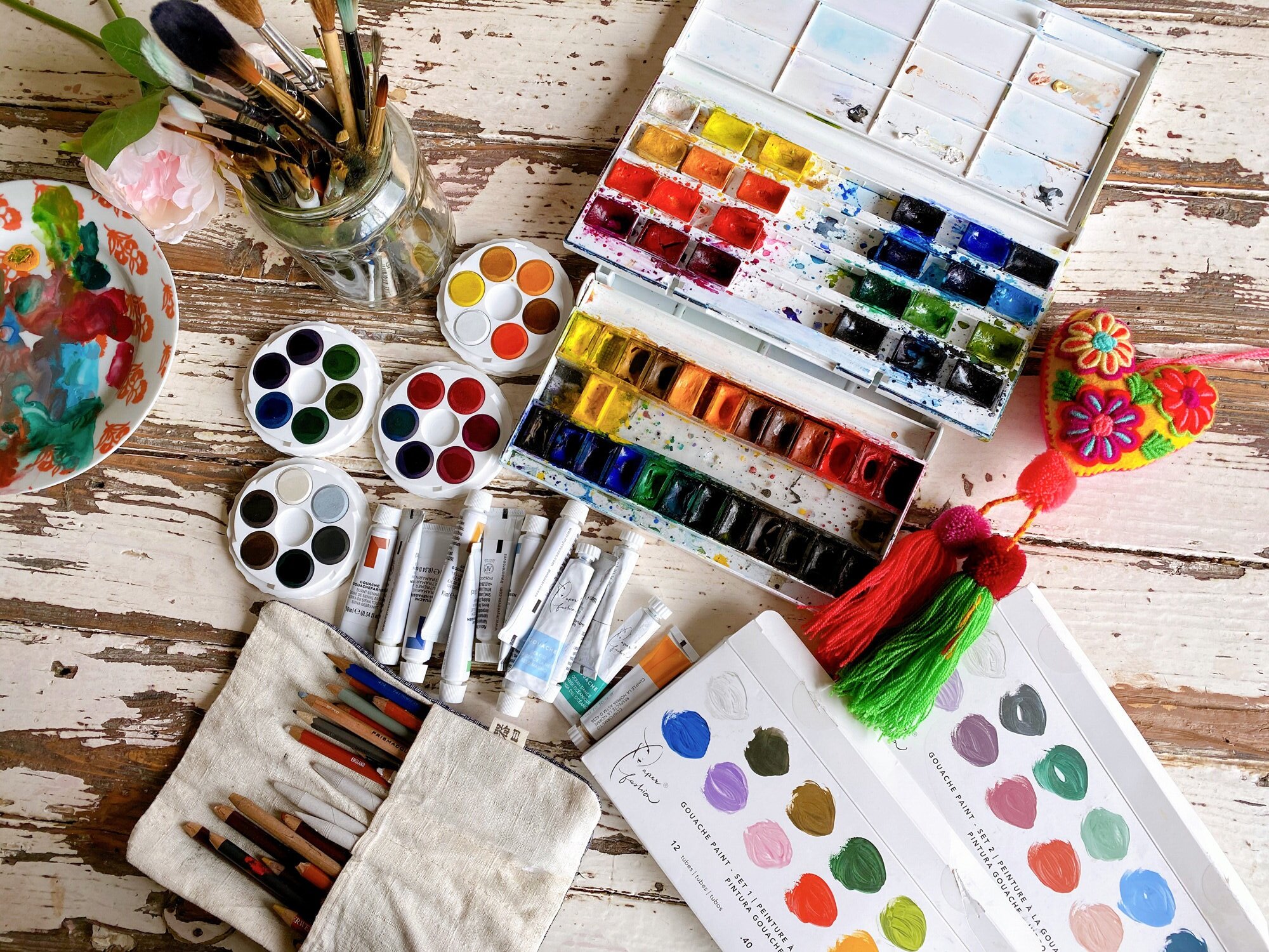
Pans vs tubes is a personal preference. Pans need to be reactivated by water, and the tubes need to be diluted with water.
I find that I waste more paint if I use the tubes, however, watercolours can be reactivated after they are dry. That means you never have to waste the paint you squeeze out. You can save your palette with all of your paint on it, and just wet it again when it’s time to paint! Sometimes they become a bit crumbly or it requires a bit more effort to reactivate, but it still works. This is not possible with other paints.
You might prefer tubes if you are doing larger works and find it easier to have tons of colour accessible when you require it for broad strokes.

For shoppers in the USA/Canada:
The following section contains affiliate links with Dick Blick, meaning I would earn a small commission at no cost to you if you purchase through these links:
Top Choices for a Beginner Enthusiast Watercolour Set:
A gorgeous, ever-popular set of watercolour paints by Winsor Newton— There are several options, and this half pan set of 12 has all of the essentials. Other options include a super cute travel set and individual colours to extend your palette if you wish. You can’t go wrong with something like this.
If this is way out of budget, I still encourage you to paint. Some decent student grade brands include Reeves (tubes) and Grumbacher.

Another beloved classic set with VIVID colours and add on options would be Daniel Smith! If you have no other colours, the 12 set is perfect. If you want to extend your palette, they have beautiful colour scheme sets too.

Top choices for the Watercolour OBSESSED -Most Gorgeous Sets Ever:
Schmincke paints are not for beginners unless you just have cash to kill and bigger ambitions for your painting journey. They are the most beautifully vivid quality pigments and would be a prized possession and tool. The 24 set is already a luxury, but they do a 36 set too… which to me seems like overkill. That being said, if someone anonymously dropped off the 36 set to me, I would not complain.

If you want to be just like me, this is my current watercolour tool kit:
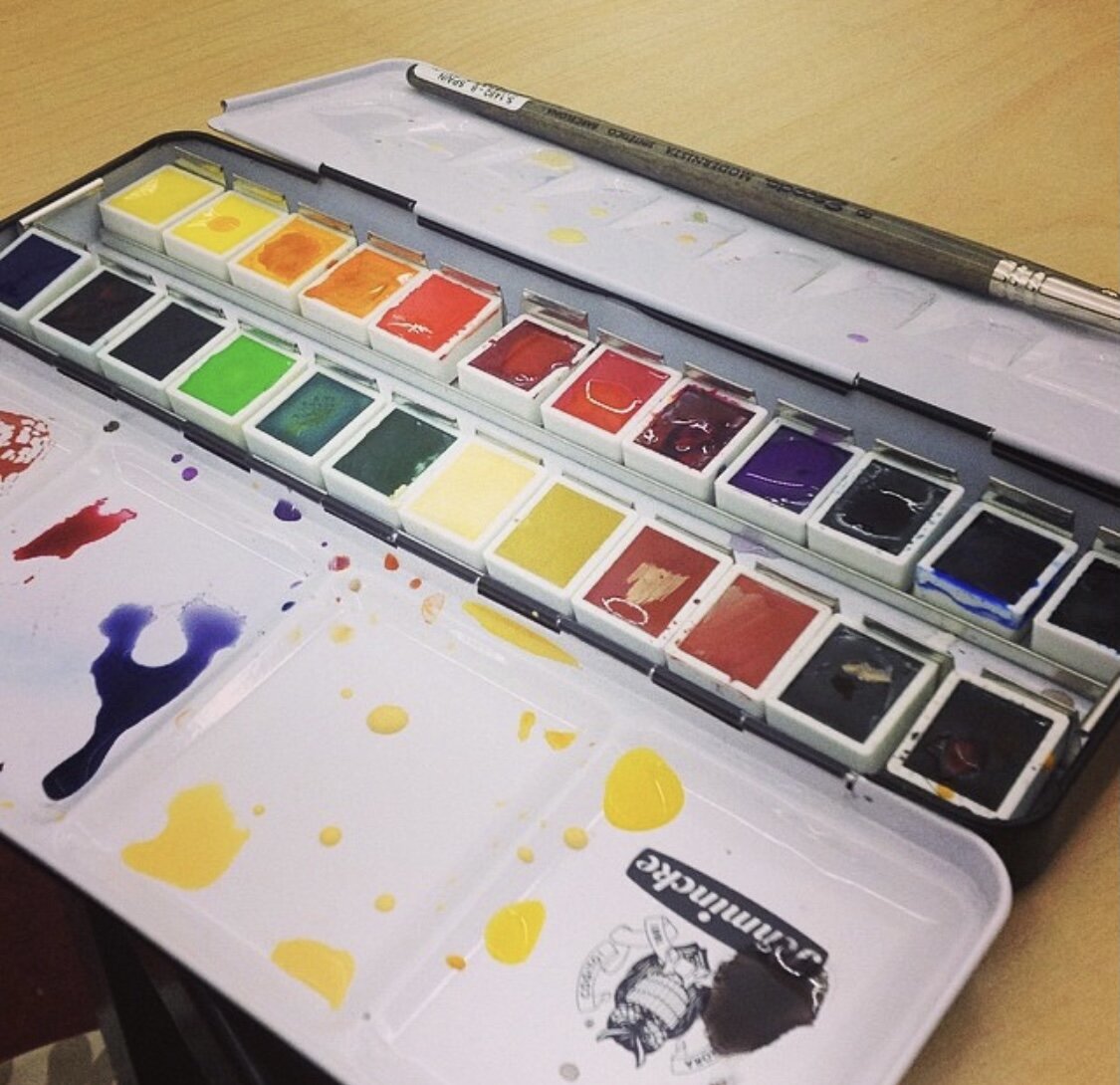
I have been using Yarka paints for the last seven years or so. As a student I couldn’t afford Schmincke paints, so I found this brand as an alternative. (Winsor Newton and Daniel Smith would also be suitable high-quality alternatives). The first set I got was the Yarka Original Set of 24. I paint pretty often and I haven’t had to replace many of the pans. I use cadmium yellow the most, so I keep an extra in the tray. It has beautiful, vivid colours and has produced MANY illustrations for me.

Click through to shop this set at Dick Blick
Once I became addicted to that set, I found their “Sequel Set” which has more turquoises, hot pinks, and a beautiful indigo blue which I now use for everything. Depending on the style and your colour palette you might not need something like this. It works beautifully for what I do.


A bird painting after my sequel set.

A few of the new pinks and purples in my Yarka Sequel set.


A whole bunch of my brushes.
Brushes for Watercolour - Where to start?!
Brushes are always a personal preference, but there are some that will make life a bit easier when painting with watercolours. The shape, flexibility, fibre and length of the bristles all do different things.
Shapes: These are all personal preferences and depend on your type of painting and style.
The most versatile shape would be the round. Round brushes hold water and also have a nice point for precision. I personally love natural pointy round calligraphy brushes from China and Japan. They hold TONS of water and retain a beautiful point.
Other really useful shapes are riggers and spotters. They are also pointy and round, but the length is different. A rigger brush is wonderful for outlining, long continuous strokes etc. The spotter brush is short so it has less flexibility and is great for extreme details.
Some might like square brushes or big mop brushes depending on the texture and style you are going for.
There are natural or synthetic fibres in brushes. Generally, the natural ones hold a point longer and hold more water, but there are many synthetic brushes that are wonderful too and will be more cost-effective. It is important for round brushes to retain their shape, so if you can afford one natural fibre round brush, spend your brush money there and buy synthetics for other shapes. Some of my favourite types of brushes are the ones that have synthetic and natural fibres mixed in so it has the benefit of natural and cost reduction of synthetic. Check them out below:
The following section contains affiliate links with Dick Blick, meaning I would earn a small commission at no cost to you if you purchase through these links.
Combo of Natural and Synthetic (the best of both worlds)
I have some of these brushes and they are gorgeous. The natural and synthetic combination makes them amazing for shape retention, quality and feel. This set of three would be perfect:

Silver Brush Set of Three
For A Fully Synthetic Set Option
This set is cheaper because it is a synthetic fibre, but it will work beautifully for smaller paintings.
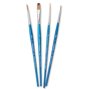
2 Round, 1 Rigger and 1/4” One Stroke


Heavier weight paper for more water.
When it comes to other types of painting, the paper or surface doesn’t really matter. For watercolour, however, the paper makes a huge difference! You might think you’re saving money on crappy paper, but if your paper starts literally pilling and coming apart, it defeats the purpose of the whole endeavour.
First, your paper needs to be acid-free. This means it won’t turn yellow and it will endure the test of time. The pad/sheet of paper should say acid-free on it. I always recommend using your crappy whatever paper for testing colours and techniques and then using your acid-free good quality paper for actual paintings. You don’t need to use your fancy stuff for a colour wheel exercise.
Second, your ideal watercolour paper should be made out of cotton! This means you can scrub it, add tons of water to it and it will let you. If you use a different type of fibre it will limit your technique.
The weight of the paper is up to you. If you use thinner cotton paper it can work, but it might buckle as you add more water to it. One way around this is “stretching” your thin paper which requires soaking it in water and taping it to a board with special tape. ( I am usually too lazy for this, but it’s actually amazing when you do it.) To save time and effort you can do a thicker weight paper, like 140lb/300gsm+.
Hot press vs cold press means the texture of the paper. When the paper is pressed into shape, the temperature makes a difference to how it turns out. Hot press eliminates most texture, so your paper will be super smooth and bump-free. Cold press will leave a texture. This is definitely a personal preference. I prefer hot press for my illustration work so I can control things a bit better afterwards. Cold press is lovely for landscapes and other paintings that texture will add character to.
You can buy paper in pads, blocks, rolls or gigantic sheets. Sometimes I recommend students get a big sheet of hot press and cold press so they can cut them up and decide for themselves which they prefer going forward.

All of my book illustrations are done on hot press arches or fabriano watercolour paper, tinted yellow first.
The following section contains affiliate links with Dick Blick, meaning I would earn a small commission at no cost to you if you purchase through these links.
Cold Press, Heavy Weight, Budget Friendly:
I have used many many many blocks of this Strathmore Paper. It’s great! 140lb/300gsm means you can really play with it.

Hot Press, Some of the Most Gorgeous Paper Ever:
Arches and Fabriano paper are my personal favourites. 100% Cotton, these pads come in blocks where one edge is gummed together, or all four edges are. That just helps it retain shape with water.


Other things!
In the world of watercolour, there are endless things you can add to this list to make your head spin: masking fluids, mediums, accessories, watercolour boards, etc. It can be overwhelming, so if you have no idea where to start - pick a simple paint set, 2-3 brushes, and some paper.
What sorts of watercolour exercises are you interested in learning about? Comment below, email, or reach out on Instagram @bermudezbahama